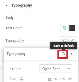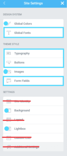
- Go to Site Settings > Typography and click the pencil, then click Back to Default
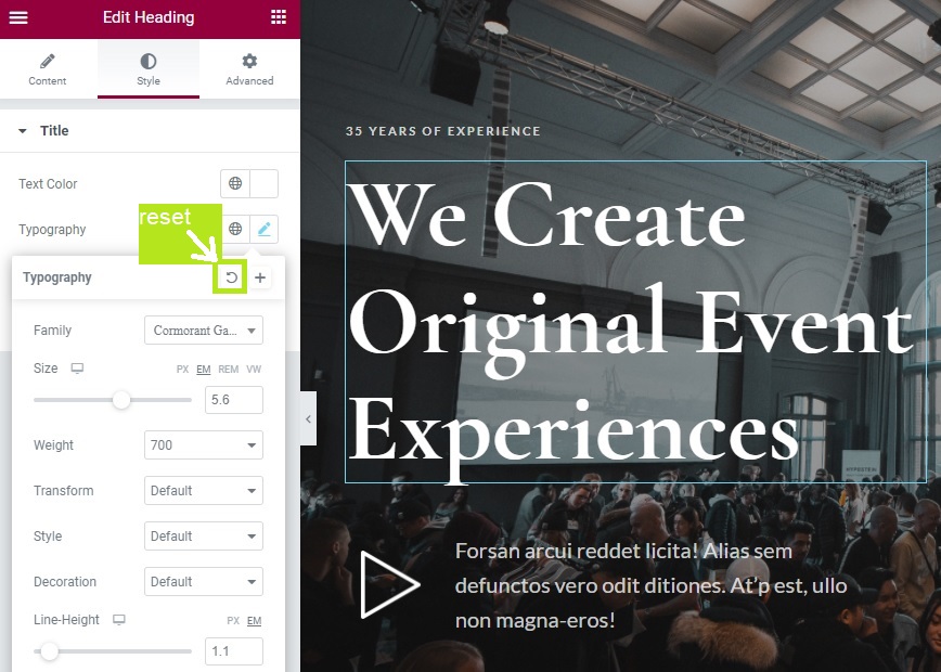
- Click the Globe icon and select the corresponding Global style for each option, except the Link option
- The links will inherit the parent style for the element
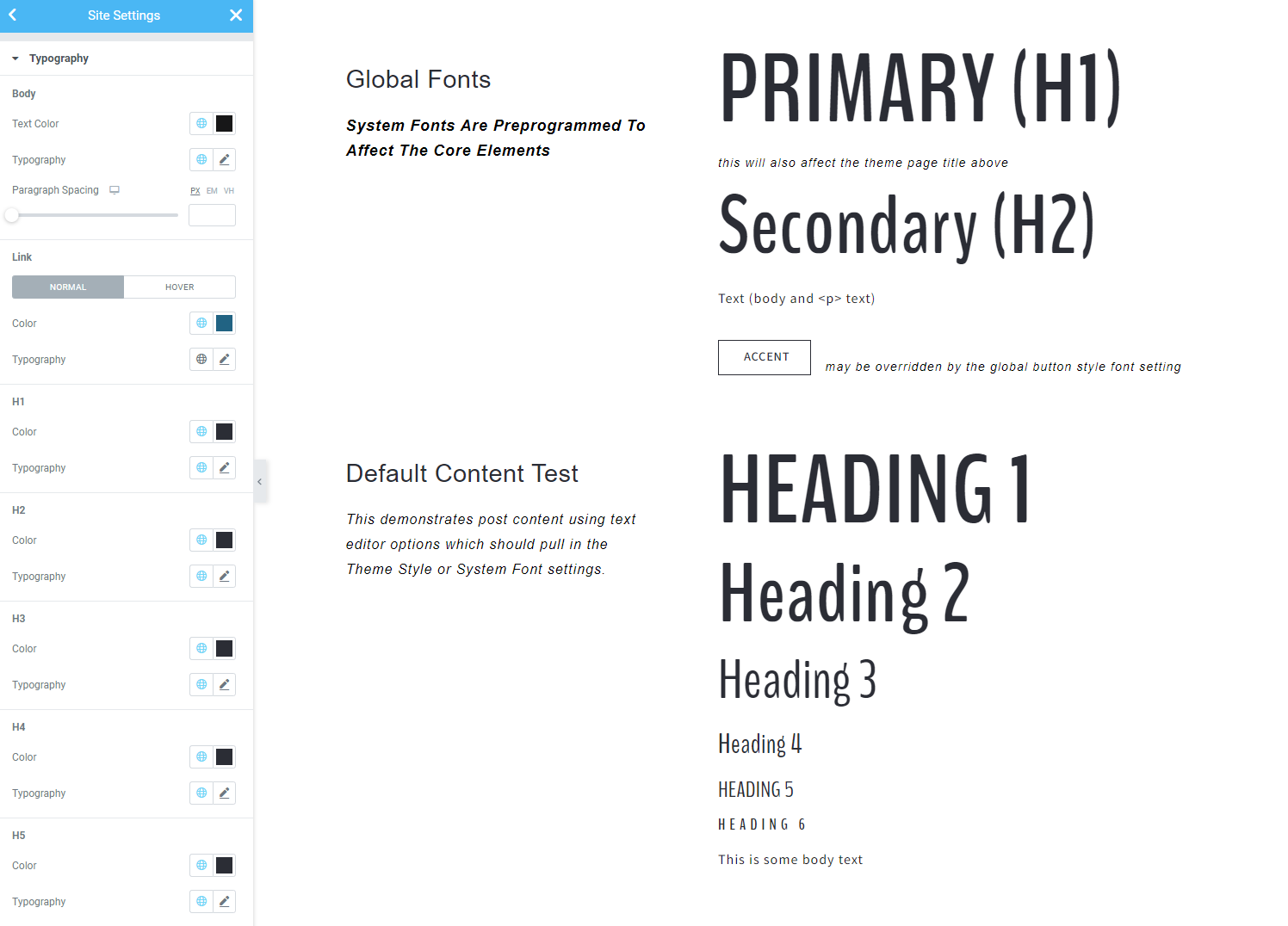
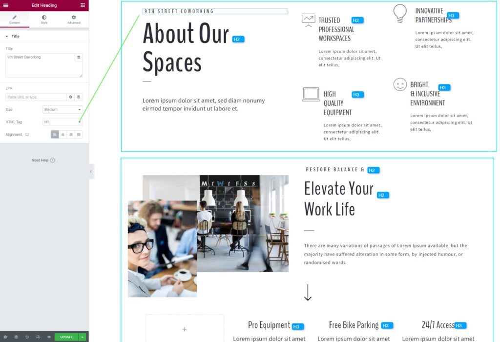
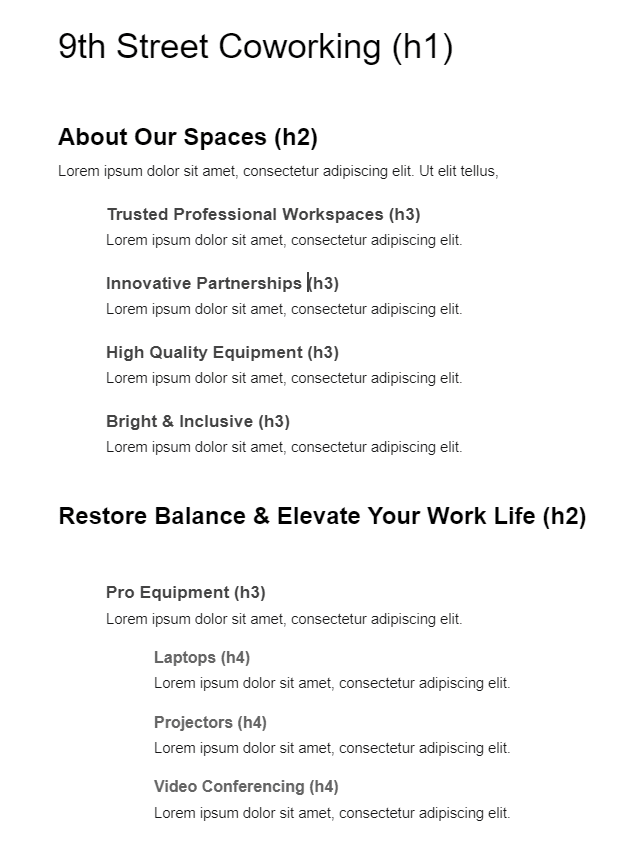
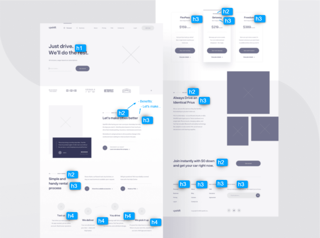
- These should follow a logical scale with H1 being larger than H2 and so on.
- To test, use the WordPress test unit dummy content, or create a post with all of the headings demonstrated.
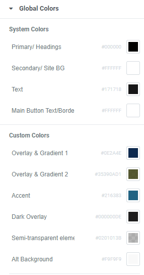
- Set a global color for each option, including the link. The color should be the default for whatever the overall background color is – for example if your pages are white, set these to the dark color. In your design, you will set alternate colors for light text on dark backgrounds separately.